Sweden's Story Remains Alarming
In this, our third comparison, the Swedish approach is increasingly deadly
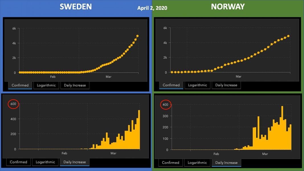
Twenty-eight days ago, I wrote a post comparing Covid-19 infections and cases between Norway and Sweden. The cases and trendlines for Sweden and Norway were as shown below (via the JHU Coronavirus Resource Center). These countries are neighbors, sharing a long border, a lot of economic features, and many cultural attributes.
Sweden continues to pursue a policy of limited public interventions and keeping schools and its economy open, while Norway has closed schools, public spaces, and non-essential businesses.
Is Sweden’s approach working? You be the judge. Here’s the history, in charts, from April 2 to April 30:
Notice the differences in the y-axes already emerging on April 2, with Sweden’s already 1.5x higher than Norway’s.
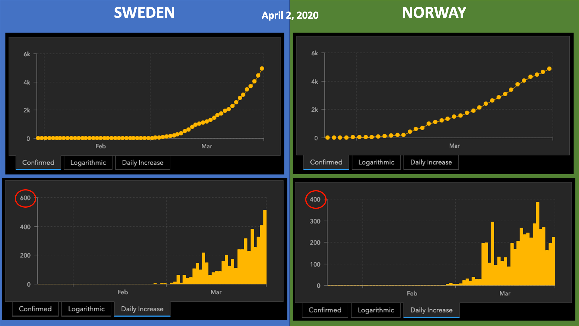
As of April 9:
Both Swedish y-axes are higher than Norway’s. This time, capturing the “Daily Increase” for Sweden requires 2x the y-axis as Norway (their y-axis remained the same), while the “Confirmed Cases” y-axis for both increased — Norway, because they nosed over 6,000 cases as their curve appeared to flatten; Sweden, because they surged to over 8,000 cases.
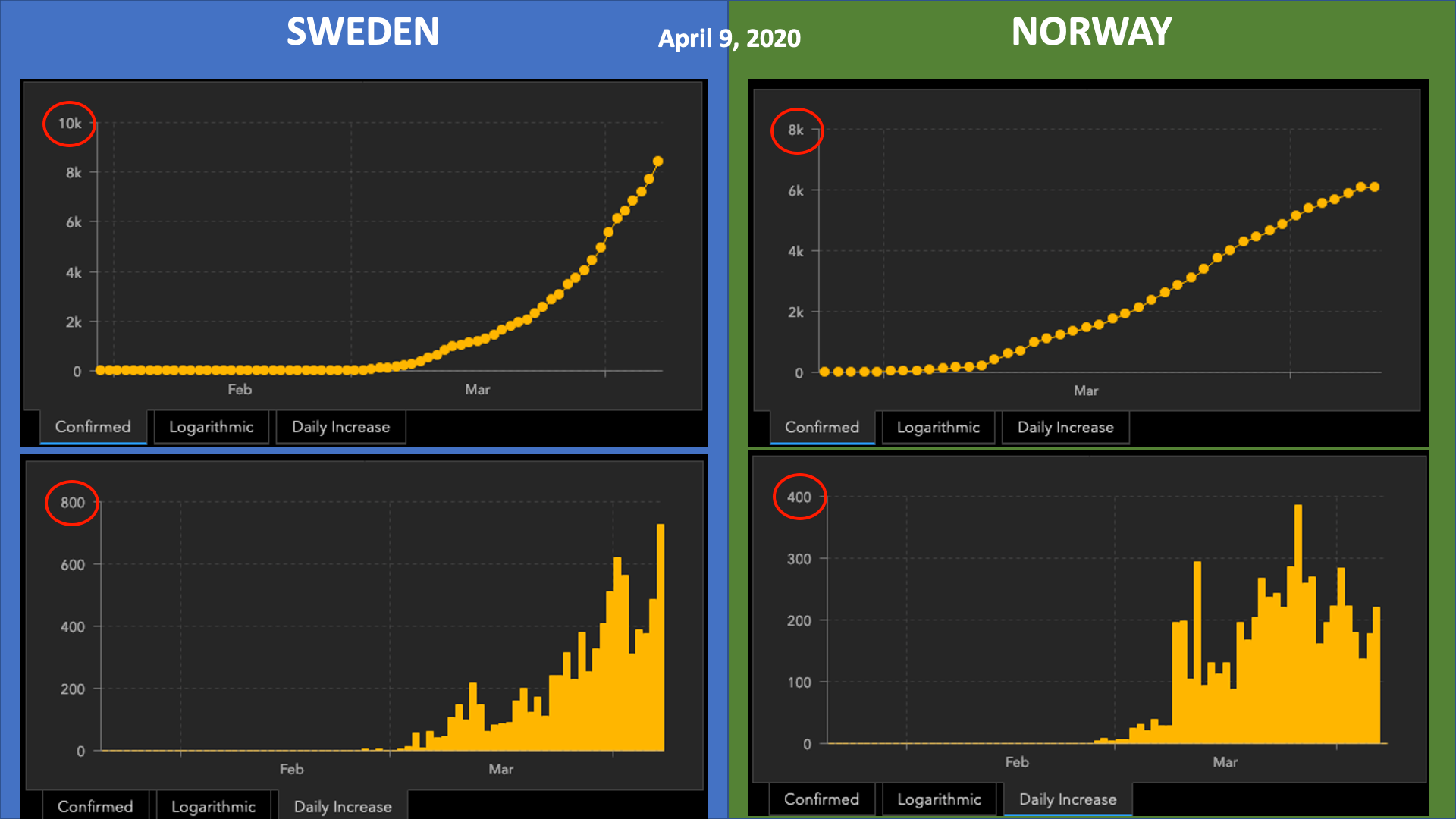
Here are the same charts as published in an update from April 21:
Notice that now the Swedish y-axes were far higher than those for Norway (20k vs. 8k for total cases, and 2x for Daily Cases). In addition, cases were definitely tailing off in Norway at that point.
To make the y-axes’ differences clearer, I matched up the measures, while adding differences in total deaths:
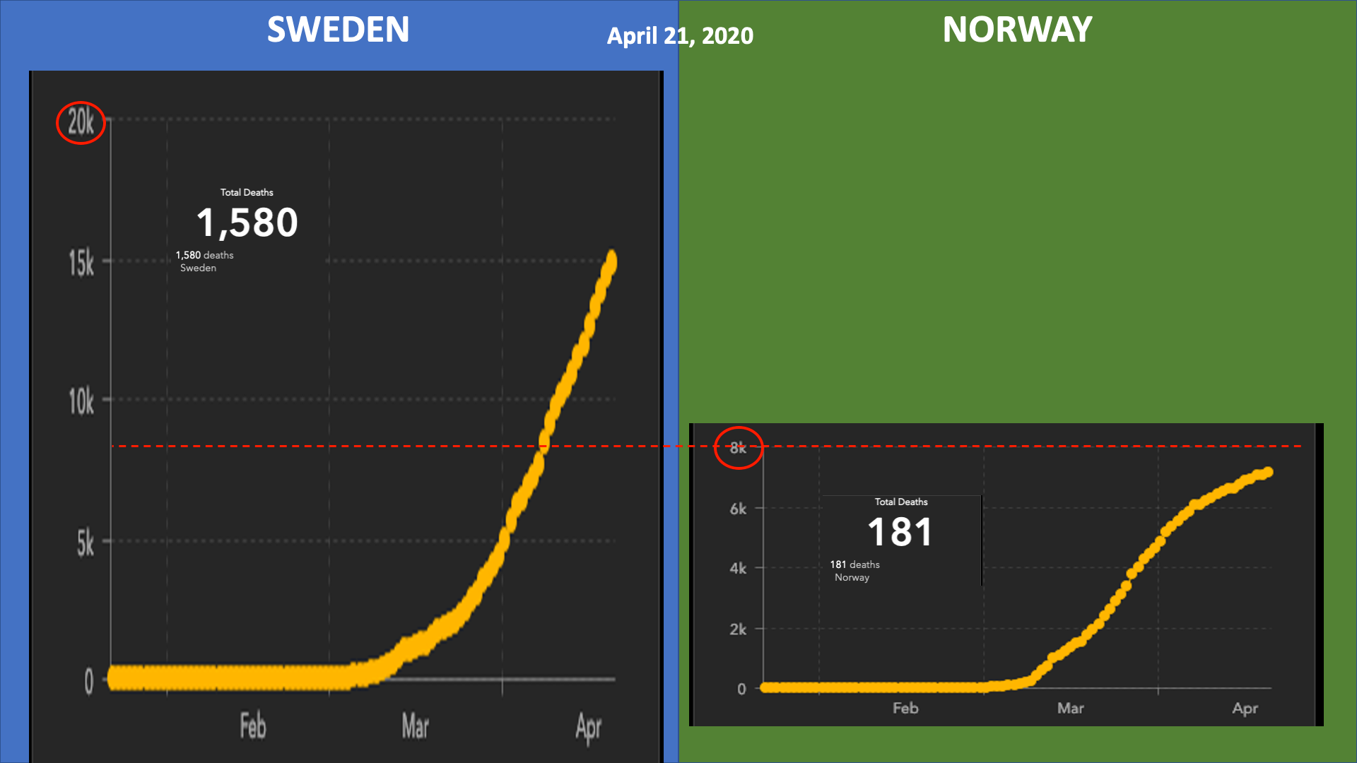
Sweden had nearly 10x the total Covid-19-related deaths as Norway just over a week ago. Back on April 8th, Sweden’s death toll was 687, and was 1,580 on April 21 — nearly 900 more deaths — while Norway’s increased from 93 on April 8th to 181 on April 21, or less than 90 more deaths in the same timeframe. In addition, Sweden’s case numbers were still climging, while Norway’s had reached what appeared to be an inflection point.
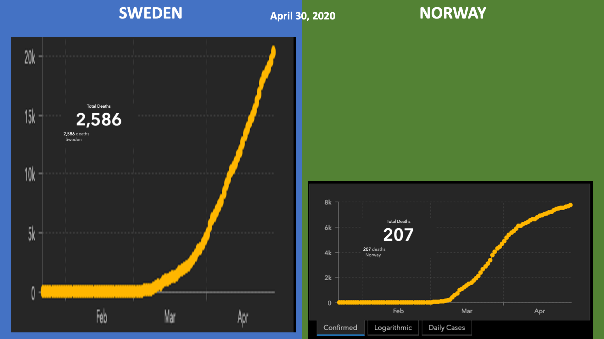
Now, for April 30th:
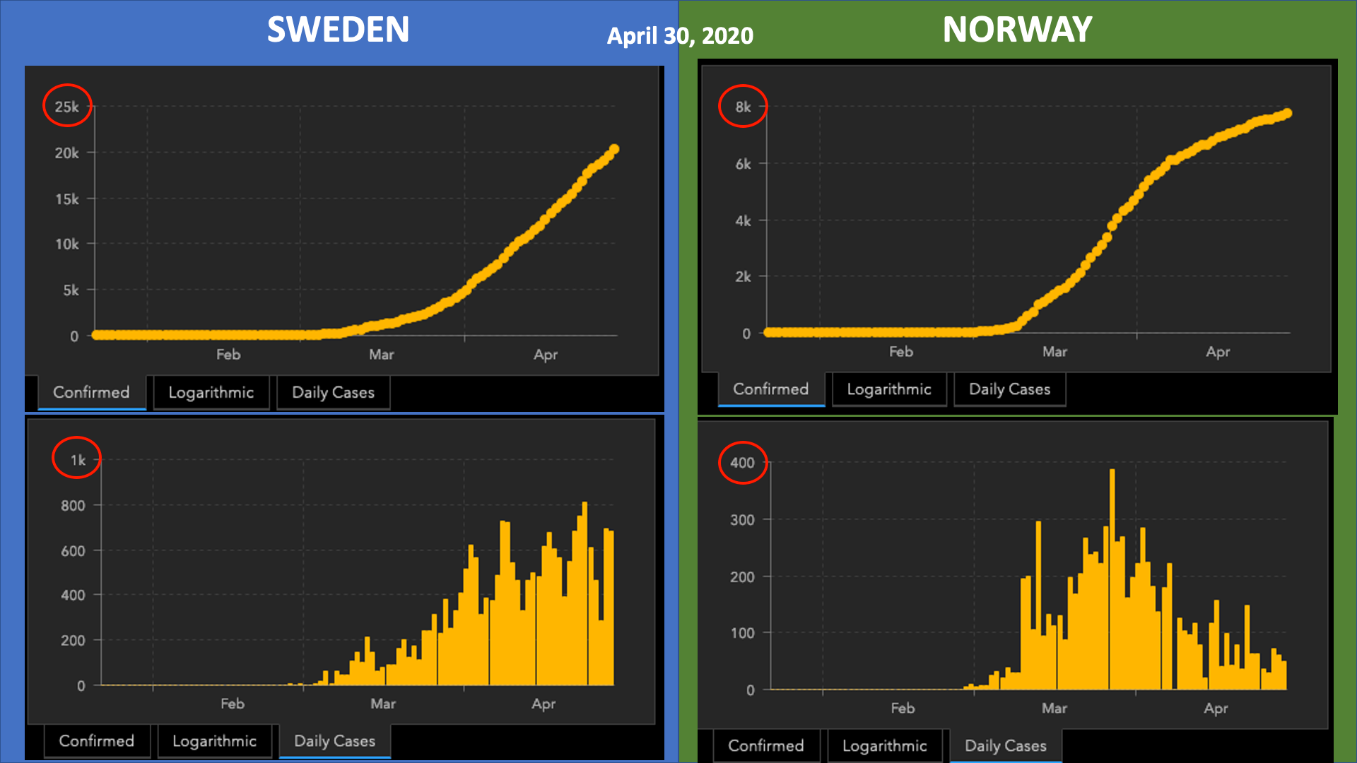
Note that Sweden broke the 20,000 confirmed cases barrier, while still accelerating. With axes aligned for confirmed case trendlines, we get the following:
Now, the same for confirmed cases data on a per-day basis:
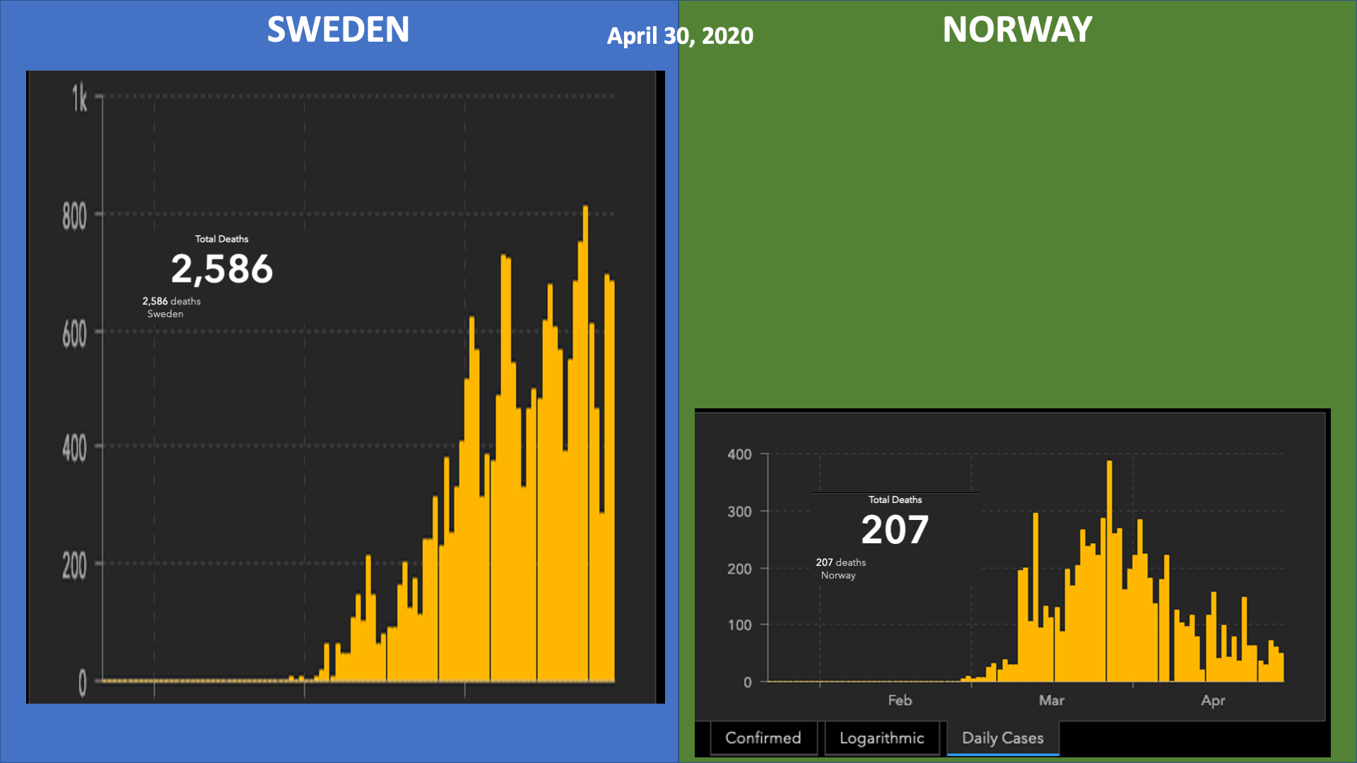
Note that deaths in Sweden are now 2,379 more than Norway, which is nearly 12x greater. Just 9 days ago, the ratio was nearly 10x for the difference in deaths between the two. Put another way, in 9 days, Norway had 26 Covid-19 deaths, while Sweden had 1,006, or 980 more deaths attributable to the disease. Given the 2-3 week latency of infections, these trendlines seem destined to continue to diverge, perhaps at an accelerating rate.
The media needs to be ringing this alarm bell more loudly, I think. As a reporter for Slate wrote in an article yesterday:
Swedes have done the least in Europe to change their movements according to social distancing, anonymized mobility data from Google has shown. When I flew into Sweden earlier this month from Los Angeles (a necessary trip—taken while dressed in mask, gloves, and a Beastie Boys’ “Intergalactic”–type faux hazmat suit), it was like arriving in an alternate universe. No screening of any kind took place. There were no pamphlets about COVID-19 precautions. It was like COVID-19 had never left Wuhan, China.
Sweden’s experiment continues to result in more infections and more deaths, with uncertain economic benefits.
Some in the US have used Sweden as inspiration for relaxing stay-at-home policies, workplace closures, and social distancing. With orders forcing meat packing plants to open, and states like Georgia and Texas opening prematurely, we’d better brace for new outbreaks, more demands for ICU beds, and higher death rates here, as well.