The Altmetric Flower Is Misleading
The "flower" design used by Altmetric obscures important data and information

I’ve been critical of Altmetric for a while now, from a post nearly a year ago to the day on the Scholarly Kitchen outlining the problems with the Altmetric Top 100, to more recently here, outlining how these problems continue, how different approaches could make these issues go away, and why using Altmetric data is a bad idea.
One of the hallmarks of Altmetric is its “flower” or “rosette,” the design that portrays multiple inputs spiraling in to generate a composite number. Without a number at the center, the flower looks generally like this:

A typical Altmetric flower with a number at its center would look like this:
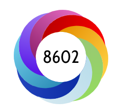
The flower design is meant to represent each data stream with a different color. Twitter is pale blue, like the Twitter logo. News is red. Blogs are gold. Facebook is blue. A category called “video uploaders” is green — these are apparently people discussing a study in an online video.
The colors included in the petals of the flower change based on the sources feeding it, but the proportions do not. For instance, an article without video uploaders would lose the green petal, but the petals remain equally proportional in all cases:
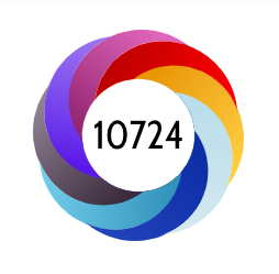
This proportionality seems intentional. In each case I reviewed, there are eight and only eight bands represented, even though the article above had contributions from 11 data sources. So we can add incompleteness to the design problems with the flower.
Edward Tufte, author of “The Visual Display of Quantitative Information” and many other books on the topic of accurately representing data visually, has one exhortation that informs all his work:
Above all else, show the data.
The problem with the Altmetric flower is that it misleads the reader by representing each data source as exactly proportional to every other one, and by being incomplete. Together, this means it doesn’t show the data.
Analyzing the data for the 2018 Altmetric Top 100, we find that 86.9% of the raw mentions (not weighted) are from Twitter. Weighting tends to drive this proportion up. For the sake of this analysis, I’ll stick with just the raw data.
Drawing an Altmetric flower that’s in keeping with this aggregate data (and more similar to what every article’s flower would look like if the data were represented proportionally), and dropping data sources contributing less than 1%, we get this:

The data shown here are 86.9% Twitter, 5.6% News, and 5.5% Mendeley readers. No other source contributed more than 1% to the data overall for the Top 100.
To bring the point home, here are the two — one showing the actual proportionality of the data sources, the other concealing this important information — side by side:

Tufte has another relevant quote about this practice:
Today’s graphics use multiple shapes and colors to cover up a paucity of data.
To reiterate the problems with Altmetric:
- Social sharing doesn’t equate with attention.
- Altmetric is too reliant on a black box.
- This black box (Twitter) has become infested with bots and bad actors.
- The Altmetric weighting system doesn’t make sense.
- Altmetric does not generate a useful index.
We can add another to this:
- Altmetric uses misleading information design to conceal its overreliance on one data source.
We’ll end with another Tufte quote, and a strong recommendation that we continue to read his works:
You want an open mind, but not an empty head. Just because something is a new or fashionable alternative, doesn’t mean we need to get stupid when judging it.
Until December 31, 2018, new subscriptions are 10% off. Avoid the 2019 price increase, and subscribe today.